words about projects
Who is going to design this new house? Then, who’s going to build it? How will they view our project? How involved can we be? Can this person take our list of must haves and translate that into something REALLY COOL?
In the last post, I noted that we’d done several TMH tours and had started to get a good “feel” for the local architecture scene. TMH is an amazing resource for all things Modern. Between the tours, the website that has amazingly comprehensive listings for homes for sale and the local architects’ resumes (both past and present) – we started here.
Hubby and I sat in the couch and had our notepads and dueling laptops, and we went through the listing of Triangle architects one by one, writing our lists with ‘definites’, and ‘maybes’. After we completed that exercise – we compared notes. Anyone that made both our ‘definites’ made the short list. Where we both had ‘maybes’, we discussed, and same thing when we had an architect that made only one ‘definite’ list.
Because this is a personal matchmaking decision, I won’t name names – but I do think its important to share what we did and why we ended up where we did. We had 4 architects / firms that we wanted to engage and speak with in greater depth. We had talked to several of them on site during a tour, but that’s not the time to discuss anything in any detail.
We spoke to 2 single architects that were not a design – build firm. One fit with our energy efficiency objective, having worked on some very efficient homes with probably the most extreme area builder of ‘green’ (man, I hate that word) homes, and another fit our need for aging in place and truly understood our goal to make the house ‘dog friendly’. Ultimately, we decided that it was imperative to us to have a design – build firm. We’ve both refereed finger pointing sessions at work as to which team was at fault for some failure and we didn’t want to do that in our house.
That left us with two good design – build firms. There was some initial concern that, while there was not a single tonic design home that we didn’t like, were they “too far out there” and too much an artist and not enough scientist (or engineer, or builder) to execute what we knew would be a very technical project. We appreciated their design process that allowed a feasibility study to be done at a VERY reasonable cost and would likely help us understand if we could make this all work. But, with the other firm, after viewing a more modern home of theirs, we thought perhaps they were “just right” – so we started there.
We went through an extensive schematic design process with Firm #1. It was very enjoyable as we went through 4 different designs and spoke to each one of them about what appealed to us, and what did not. One of the more bizarre items that we threw out there was that we wanted a house with “no sheetrock and no 2×4’s”. While it sounds odd, it was really meant more to challenge the teams to think differently and not necessarily an edict. Ultimately, we learned a LOT through the initial design process with the first team. We learned that I wasn’t going to win the battle and get a flat roof, and that we really did want single floor living, and that we were going to be pushing the envelope on both design and energy efficiency.
Technically, we could have gone forward with the design we had – it worked, it was certainly aesthetically pleasing, and I am sure would have been a great, custom, liveable house. But – it wasn’t as “boundary pushing” as we were looking for. It was conventionally constructed and contained many of the dreaded sheets of sheetrock and tons of 2×4’s… Because tonic design had the Feasibility Study option – we felt we owed it to ourselves to see if there was a better fit out there before making such a major commitment.
After a meeting or 2 with Vinny, Katherine and Maggie, it was apparent that this team not only would rise to the occasion – they would thoroughly enjoy the challenge and loved the idea of no sheetrock and no 2×4’s. The design process was so tactile and creative (think building blocks, clear lucite chunks, clay, paper, scissors and tape) it allowed a level of engagement and involvement by us, the client, that it truly felt like “our” house already. There was a sense of adventure when we started on the LEED Platinum route, and when we started asking about concrete sandwich panels, and all sorts of other nontraditional materials – it was met with a true sense of engagement and the collaborative effort we were looking for. We knew this was the place and that the house would be exceptional.
Next up – performance, cost and form following function. (or, as it’s sometimes known – the engineer vs the marketing chick….)
Like this:
Like Loading...
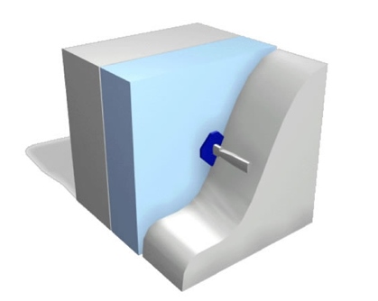
 The net out of these discussions and site tour was that it appeared that they could do exactly what they claimed they could do – deliver concrete sandwich panels that could form the outer walls for both buildings for our project. So our crazy wild assed idea to use concrete on our interior walls was actually possible. Not only was it possible – it seemed that properly executed concrete sandwich panels would deliver both our interior and exterior finished walls in a single product.


